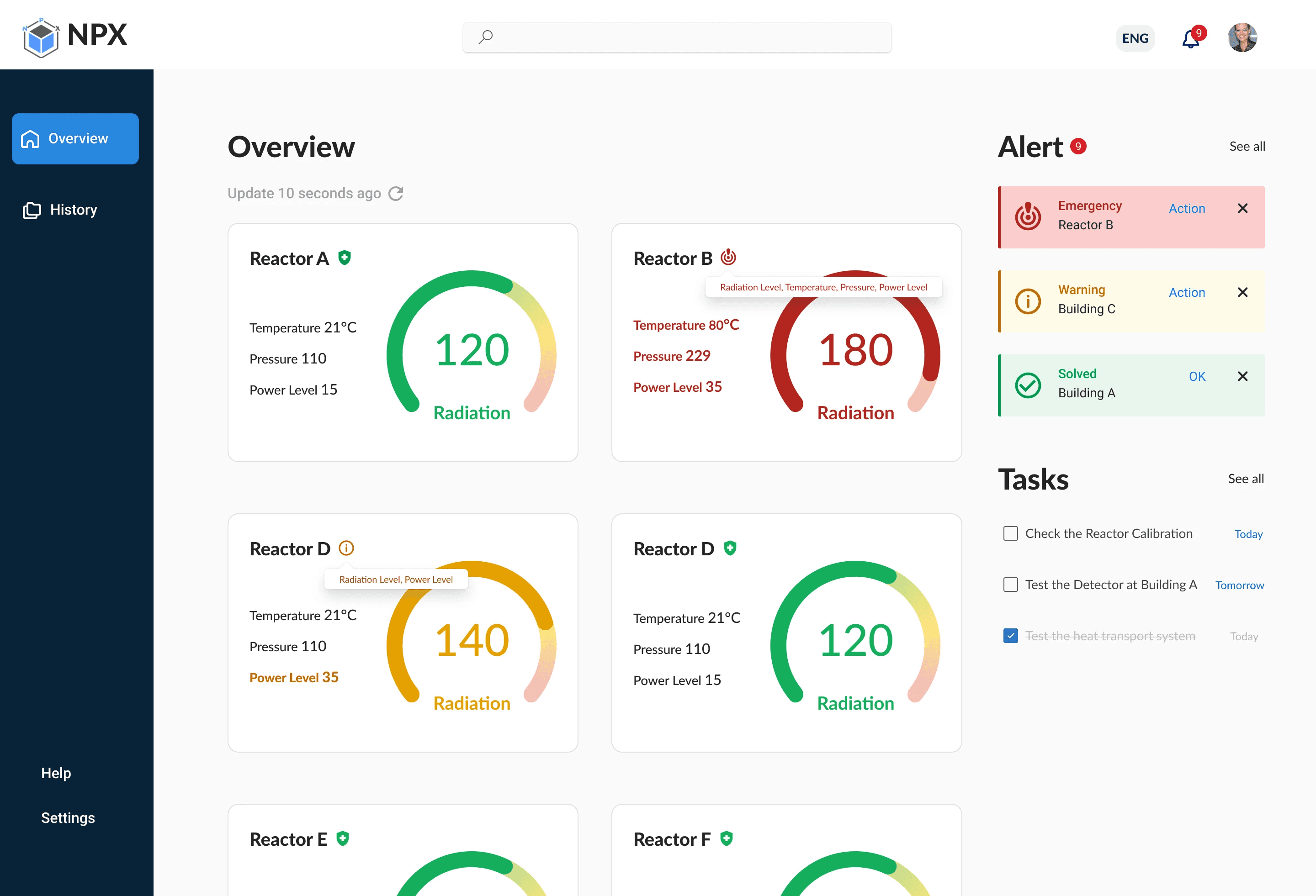
SaaS Radiation Level Monitoring Dashboard
Rapid Prototyping for a B2B Tablet App with Iterations to Meet Accessibility Standards
Time
Nov 3 to 5, 2023
Sep 17, 2024 (Iteration)
Tool
Figma
Our Group
Lin Peng, Yiyan Pan, Ziwen Zhou
Client
NPX
PROJECT OVERVIEW
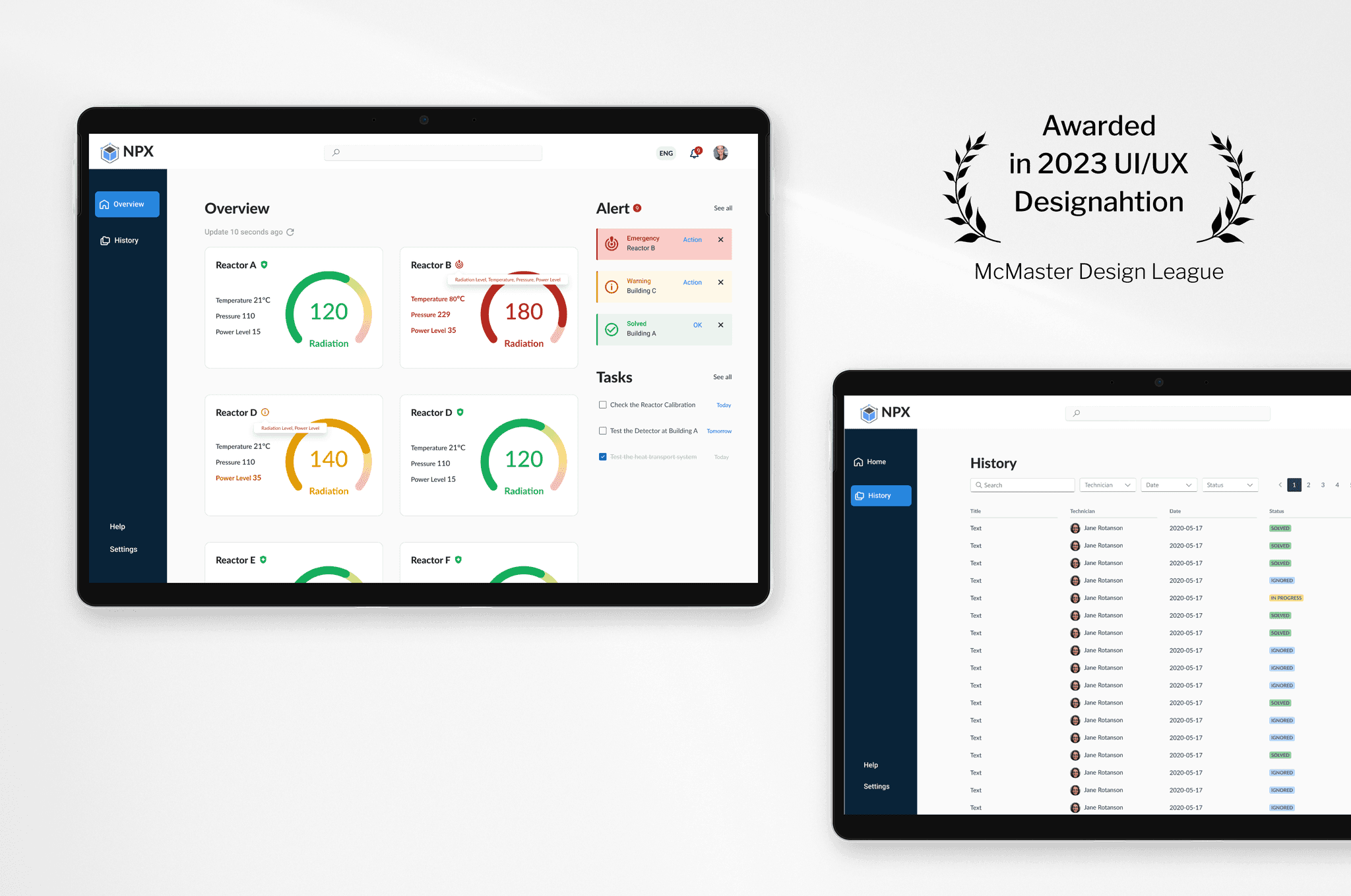
In the McMaster Designathon, our team of 3 designed a tablet app to assist nuclear reactor technicians in monitoring radiation levels. Collaborating effectively within a 36-hour timeframe, we developed prototypes from scratch and won the award.
After the competition, I continued refining the project, proactively enhancing accessibility based on valuable feedback from mentors to elevate the final product.
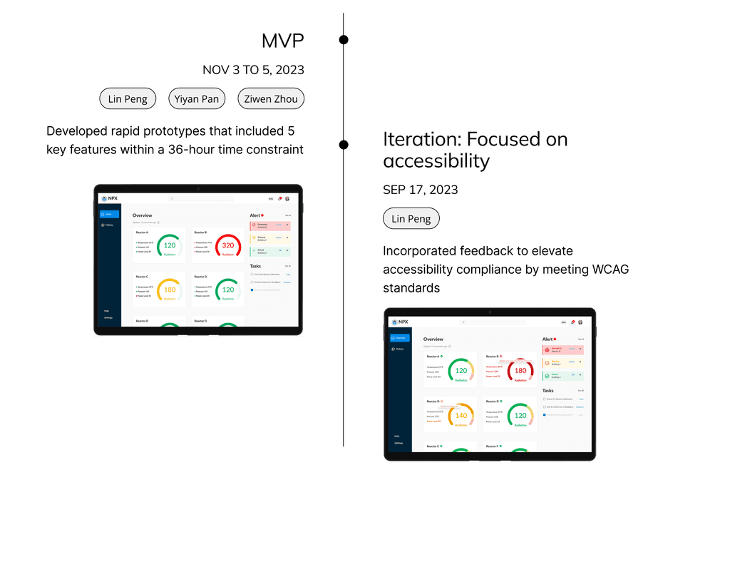
TIMELINE
PROBLEM STATEMENT
Technicians in nuclear reactor facilities need to monitor radiation levels accurately to ensure safety and enable quick responses in critical situations.
DESIGN PROCESS
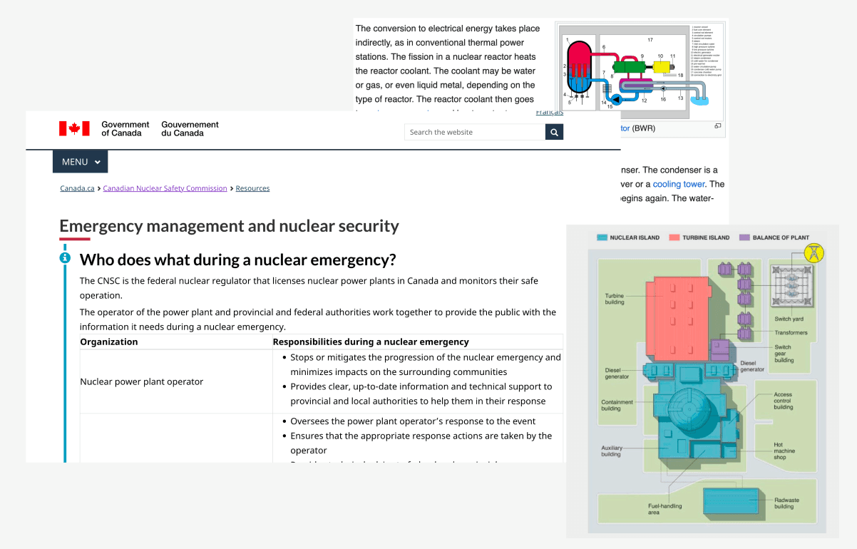
1. Understanding Nuclear Requirements and Policies
Through studying documents and research on nuclear requirements and policies, we gained foundational knowledge in this new field, setting the stage for our next steps.
2. Defining User Needs
Faced with a tight time constraint, we adopted the Lean design framework to identify the primary user needs efficiently.
To prioritize user needs effectively, we analyzed and created user stories to capture key needs across various scenarios.
User Stories
As a nuclear facility operator, I…
"I want to monitor real-time reactor performance metrics so that I can quickly detect and respond to any issues."
“I want alarms to be sorted by urgency so that I can focus on the most important ones first.”
“I want reminders for scheduled maintenance with clear instructions so that I can keep everything running smoothly.”
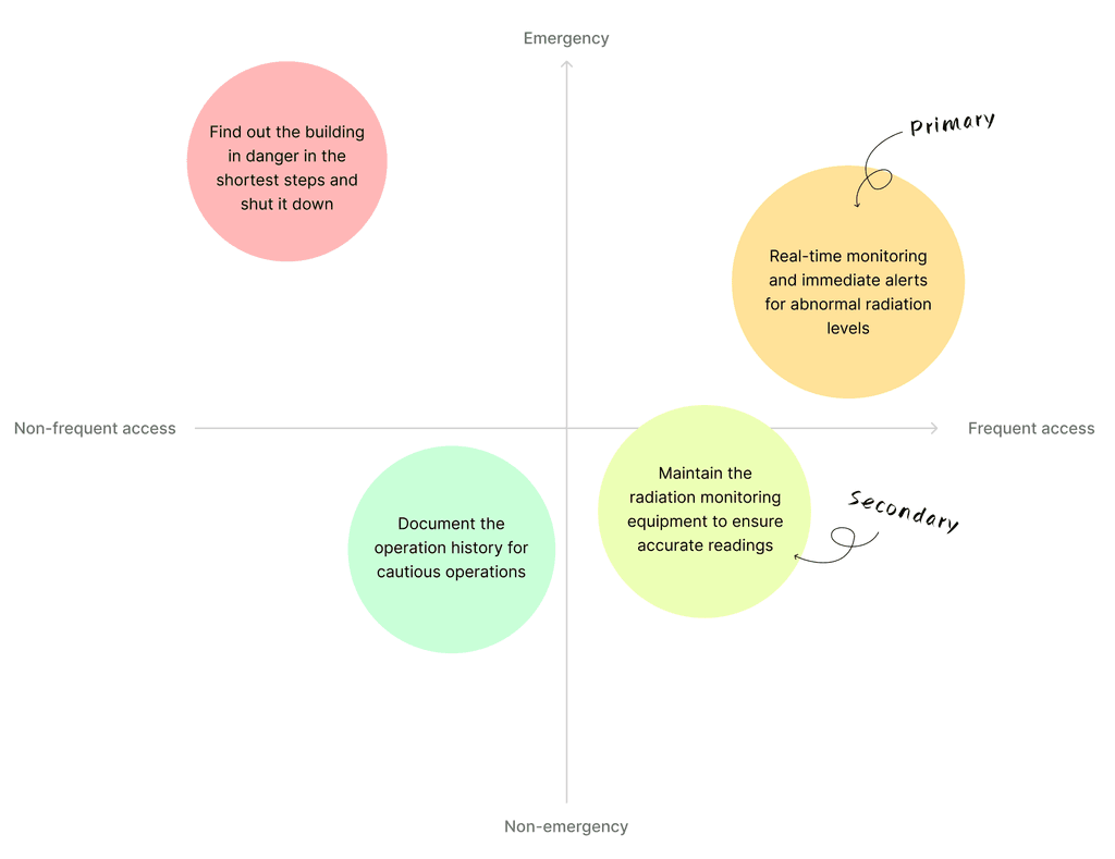
After defining the major user needs, we categorized and prioritized them to guide the design of key user interface elements:
User Needs Categorized by Emergency and Access Frequency
3. Effective Collaboration for Ideation
We worked together to generate the best ideas and align everyone on the same page. Once we developed a visual user journey, we broke tasks into smaller steps, allowing us to work separately and maximize our time effectively.
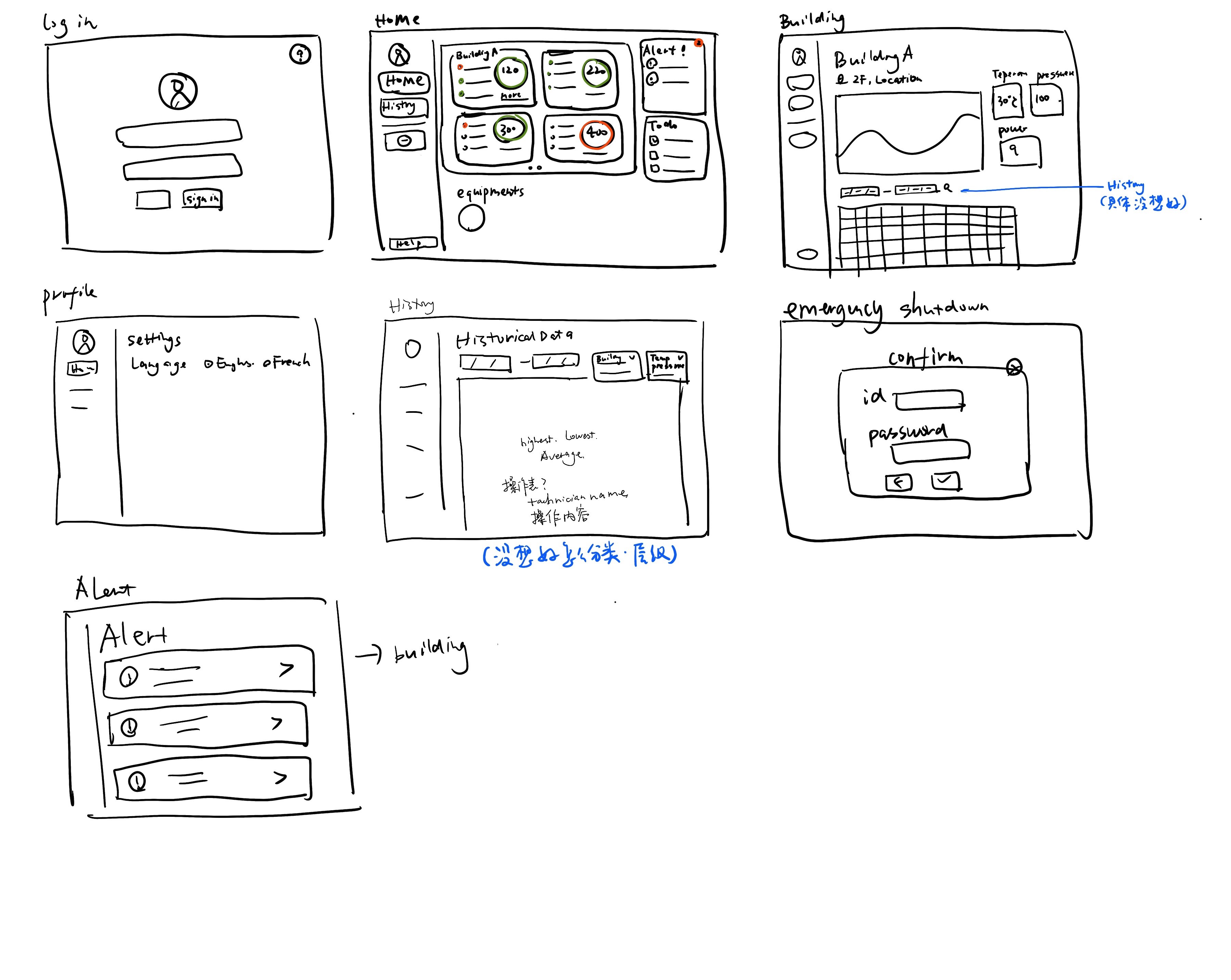
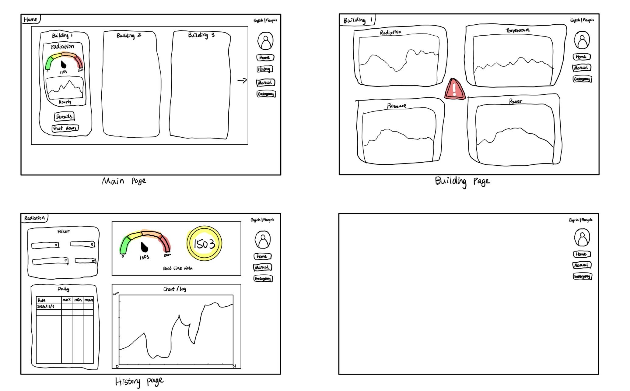
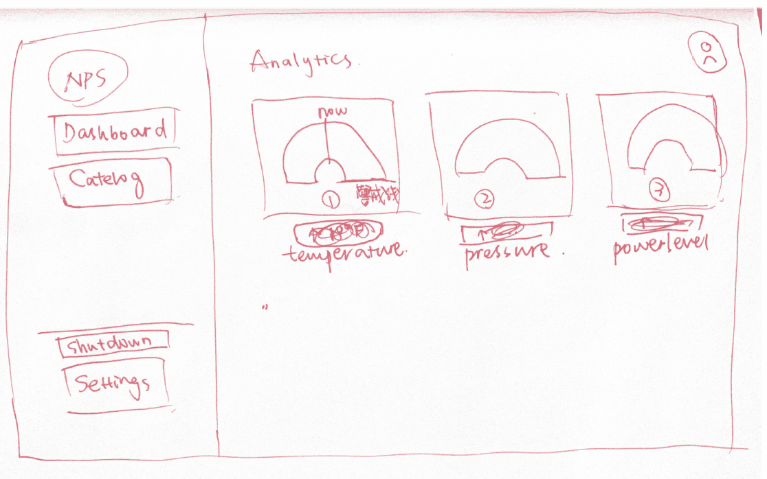
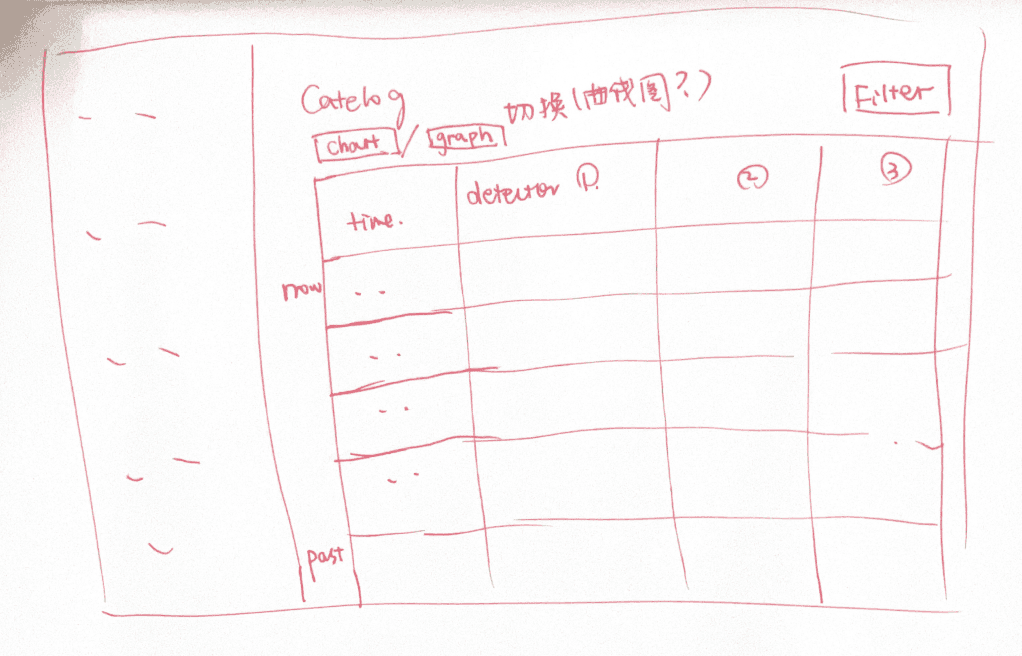
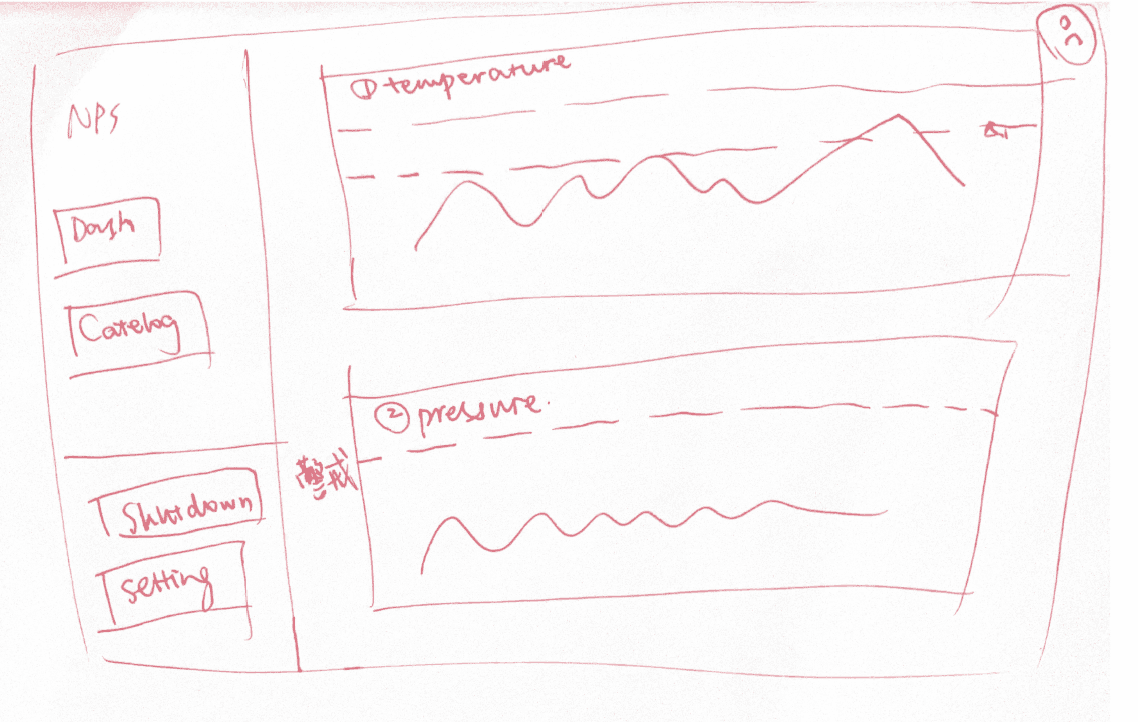
Sketches
Through collaborative brainstorming sessions, we generates various concepts and ideas for the dashboard's features, data visualization, and user interface.
User Flow
This user flow involved mapping out the sequence of steps a user would take when interacting with our system.
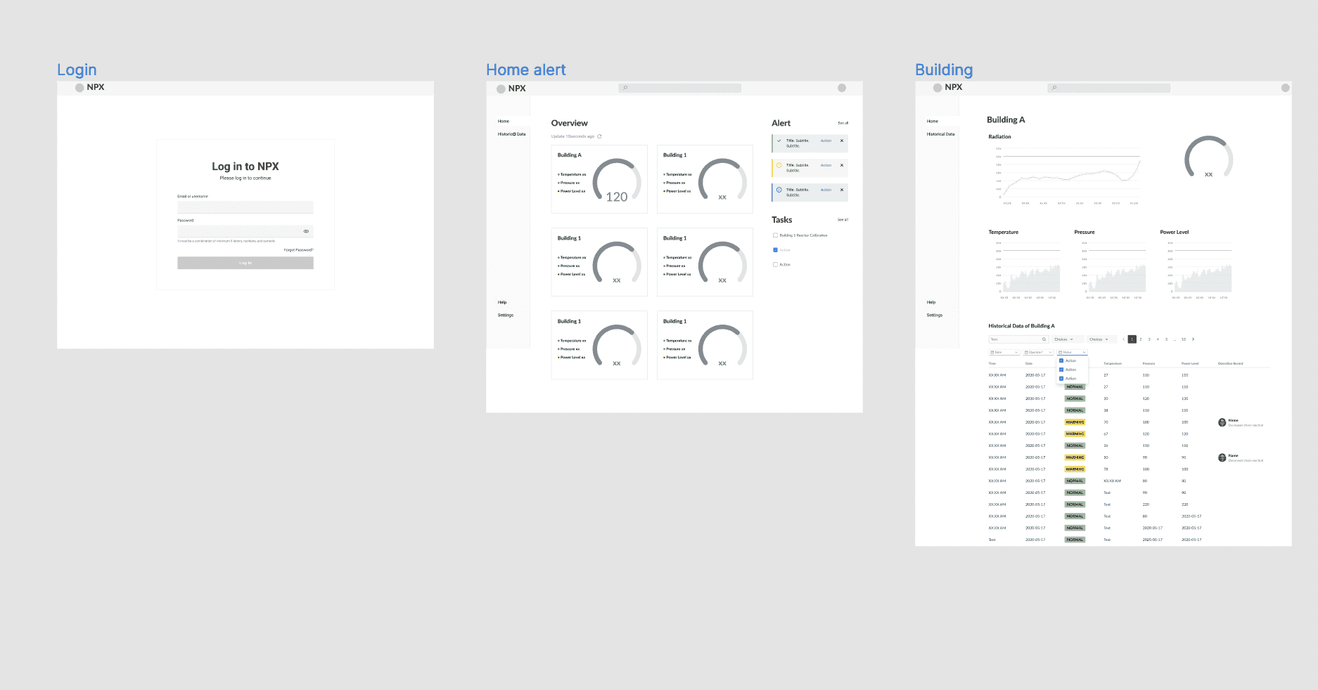
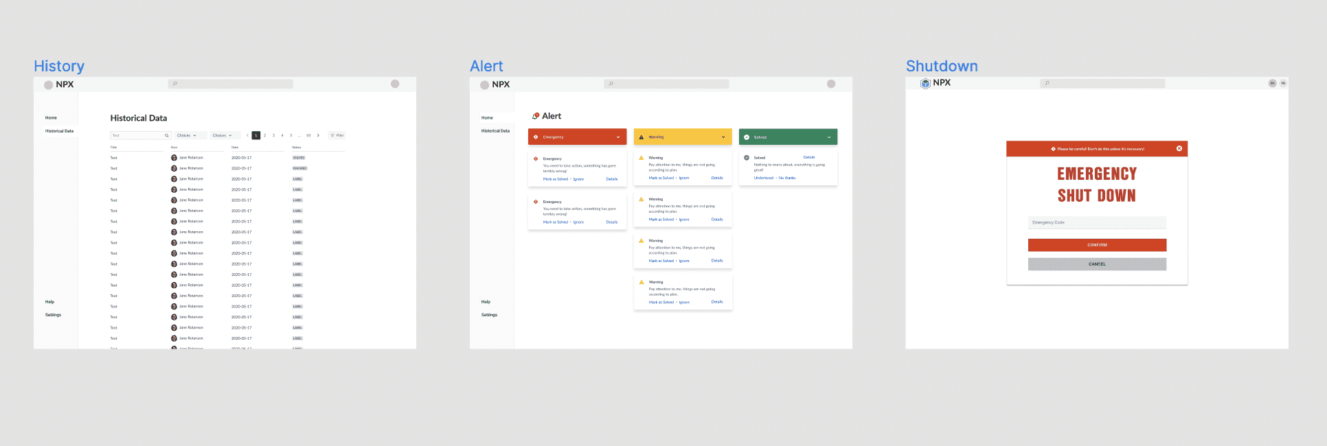
Wireframe Design, Testing & Refinements
Design Solutions
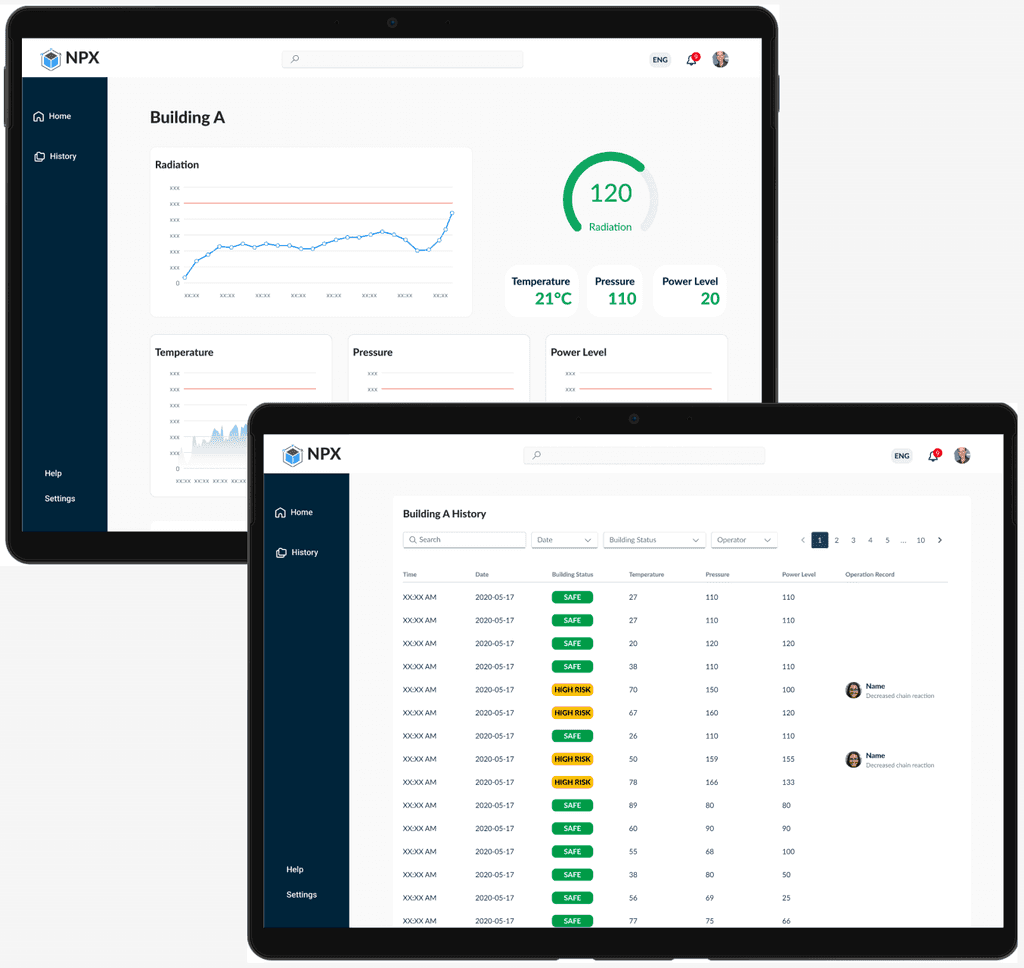
Feature 1: Overview
Shows real-time information across different buildings
Feature 2: Historical Data System
Maintain precise, time-stamped records
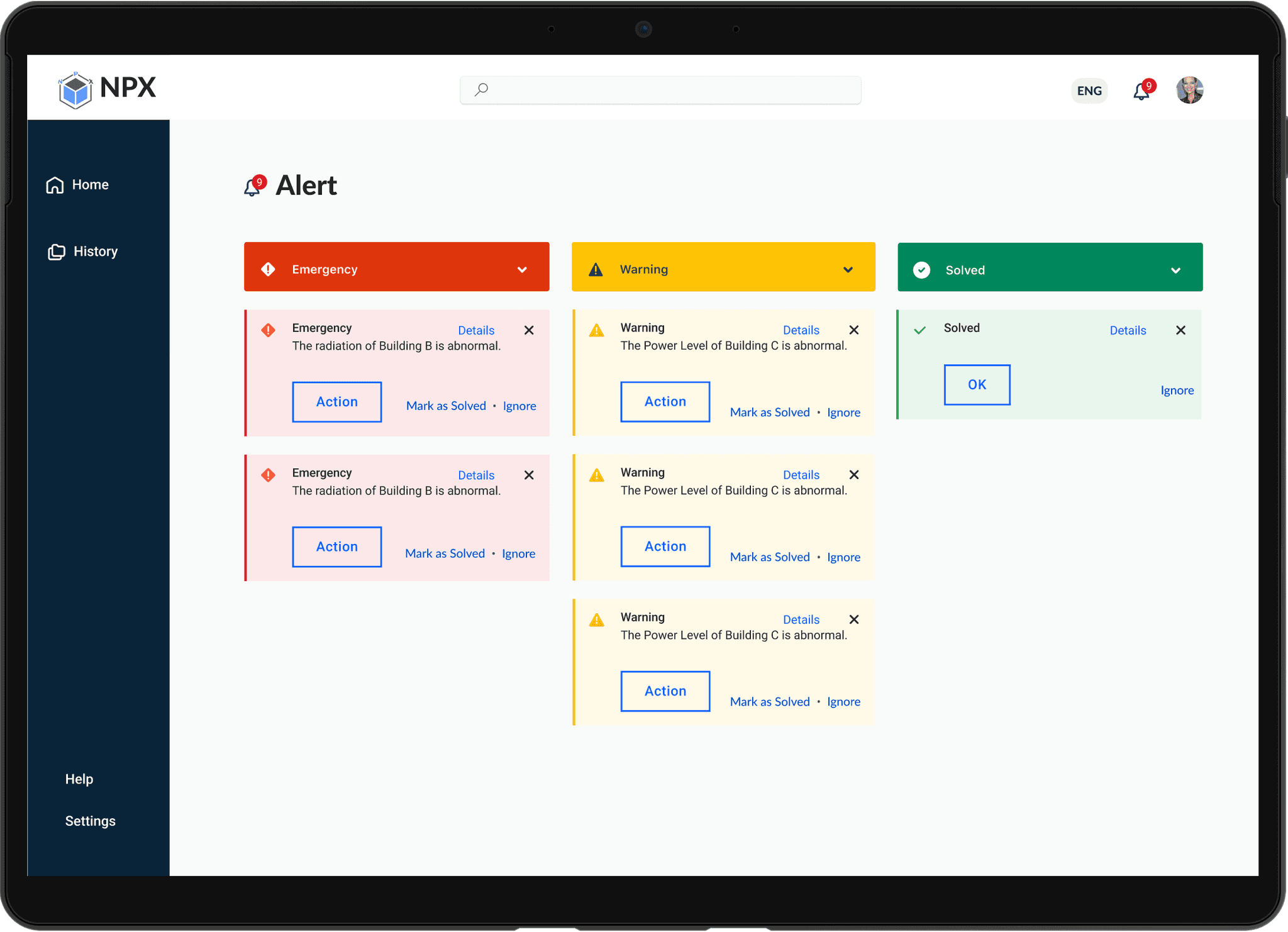
Feature 3: Alert System
Proactively inform users about potential safety hazards
Feature 4: Task Management
Reminds users of scheduled maintenance activities, promoting consistent upkeep
Feature 5: Emergency Shutdown
Providing swift action during critical situations
Prototype
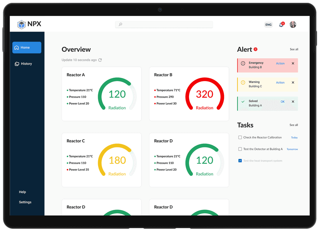
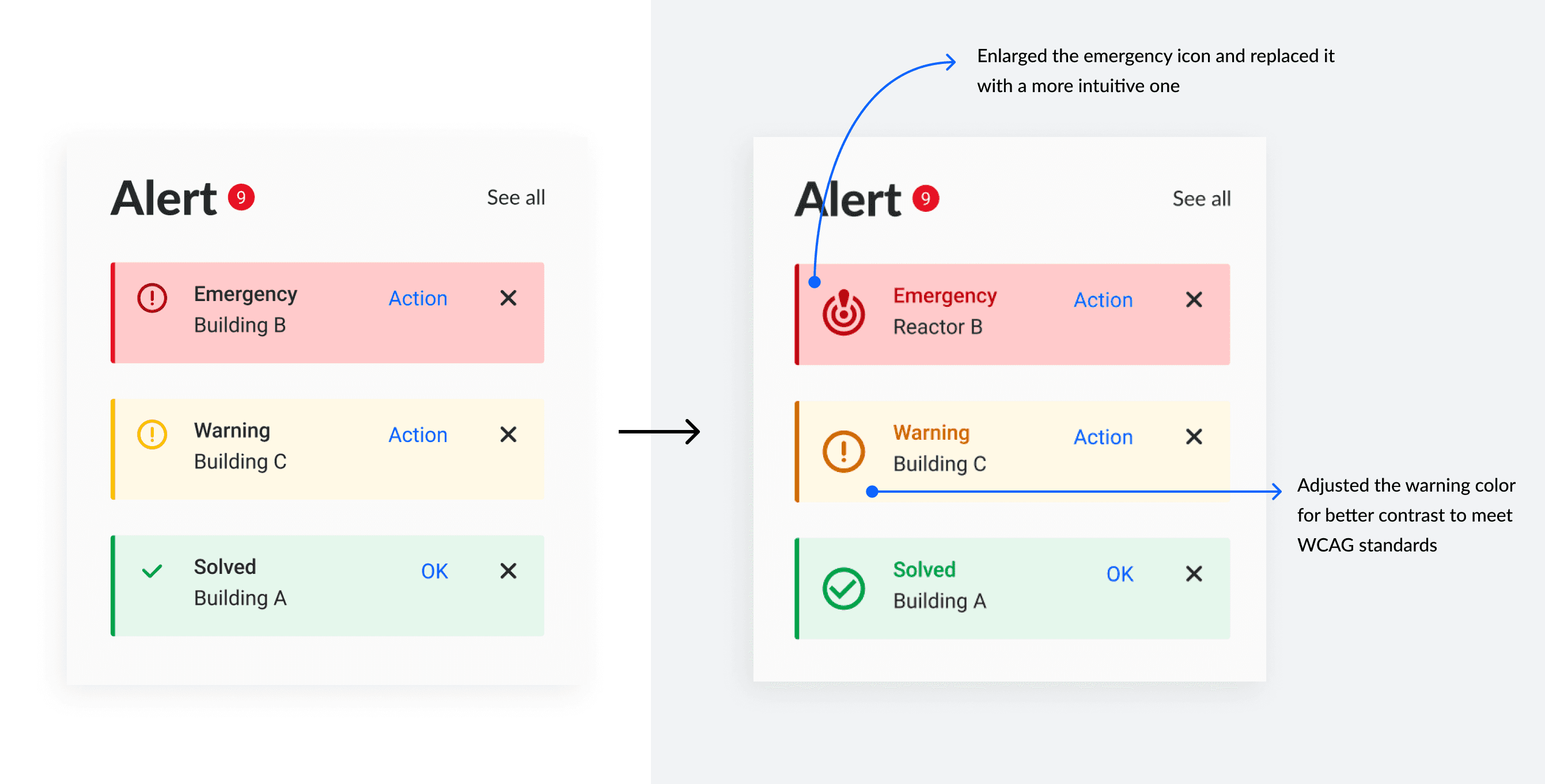
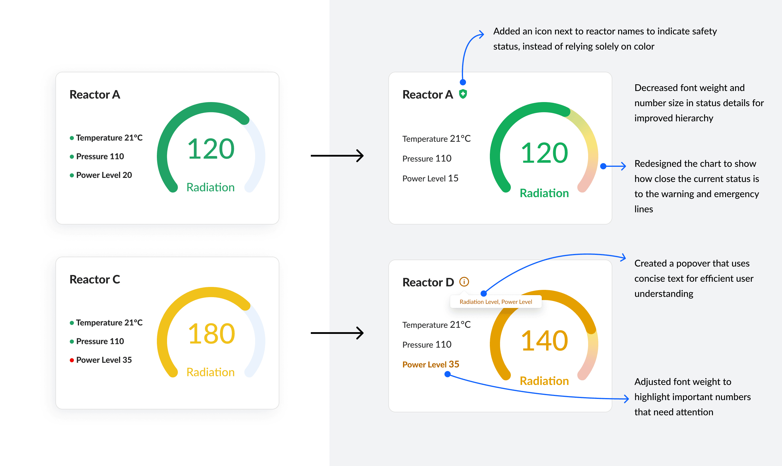
Iteration: Focused on accessibility
Updated in 2024
During my continuous learning journey following the Designathon, I delved deeper into inclusive design and accessibility principles. In the original design, colors were used to indicate different emergency levels, which could confuse users with color vision deficiencies.
To enhance inclusivity, I redesigned the interface by incorporating icons, a clearer hierarchy, and more informative charts alongside the color indicators.
