Streamlining a Complex Checkout Process
Reduced cart abandonment and increased overall traffic
Time Frame
2 Weeks
Tool
Figma
My Role
UX/UI Designer
Client
Folio
Background
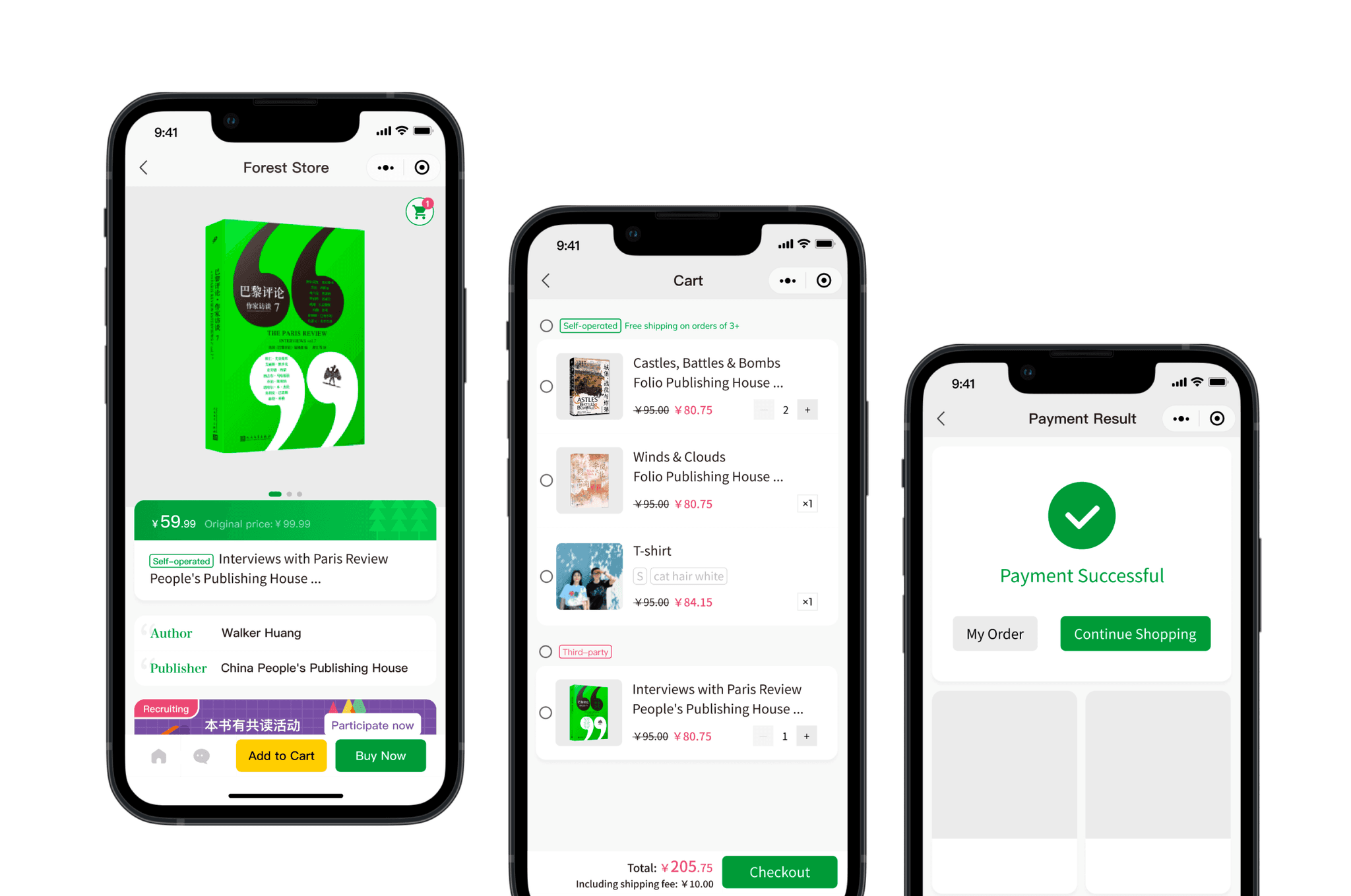
Forest Store is an online bookstore and book club. Due to the items' complexity and technical constraints, Forest Store didn’t have a shopping cart feature. Customers had to go straight to payment after selecting an item, leading to a significant number of abandoned transactions.
As the UX/UI designer, I designed a user-friendly checkout process to tackle this challenge.
Challenge
Initially, the checkout processed was faced with these issues:
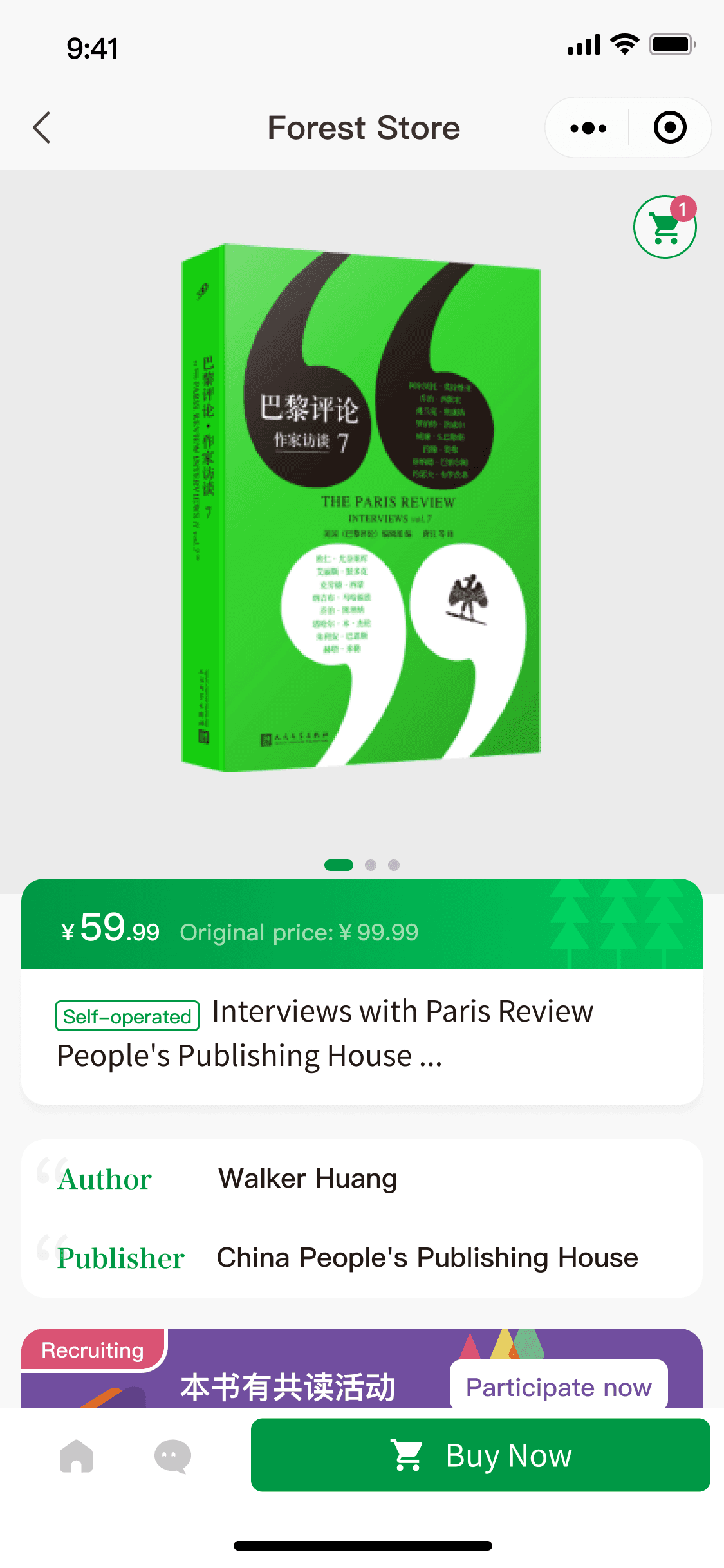
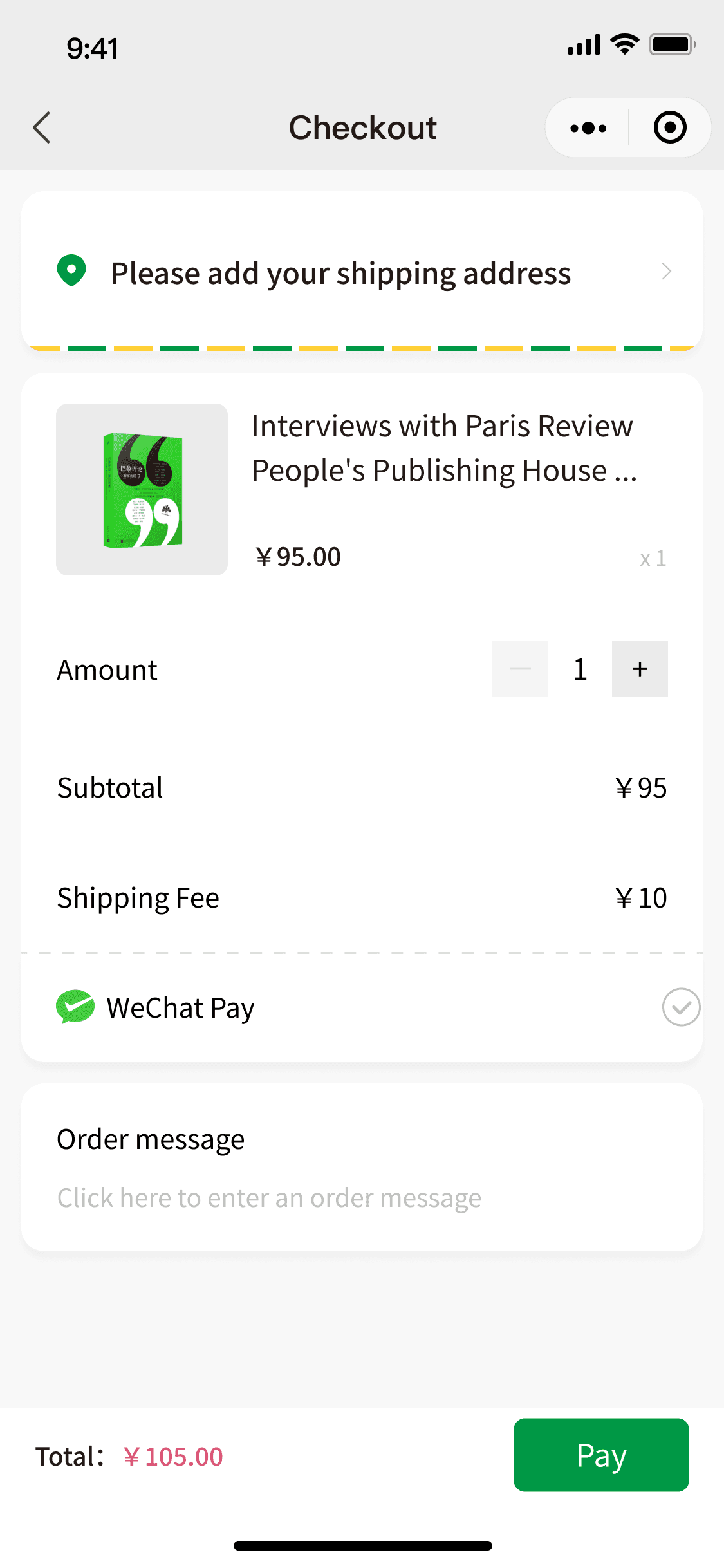
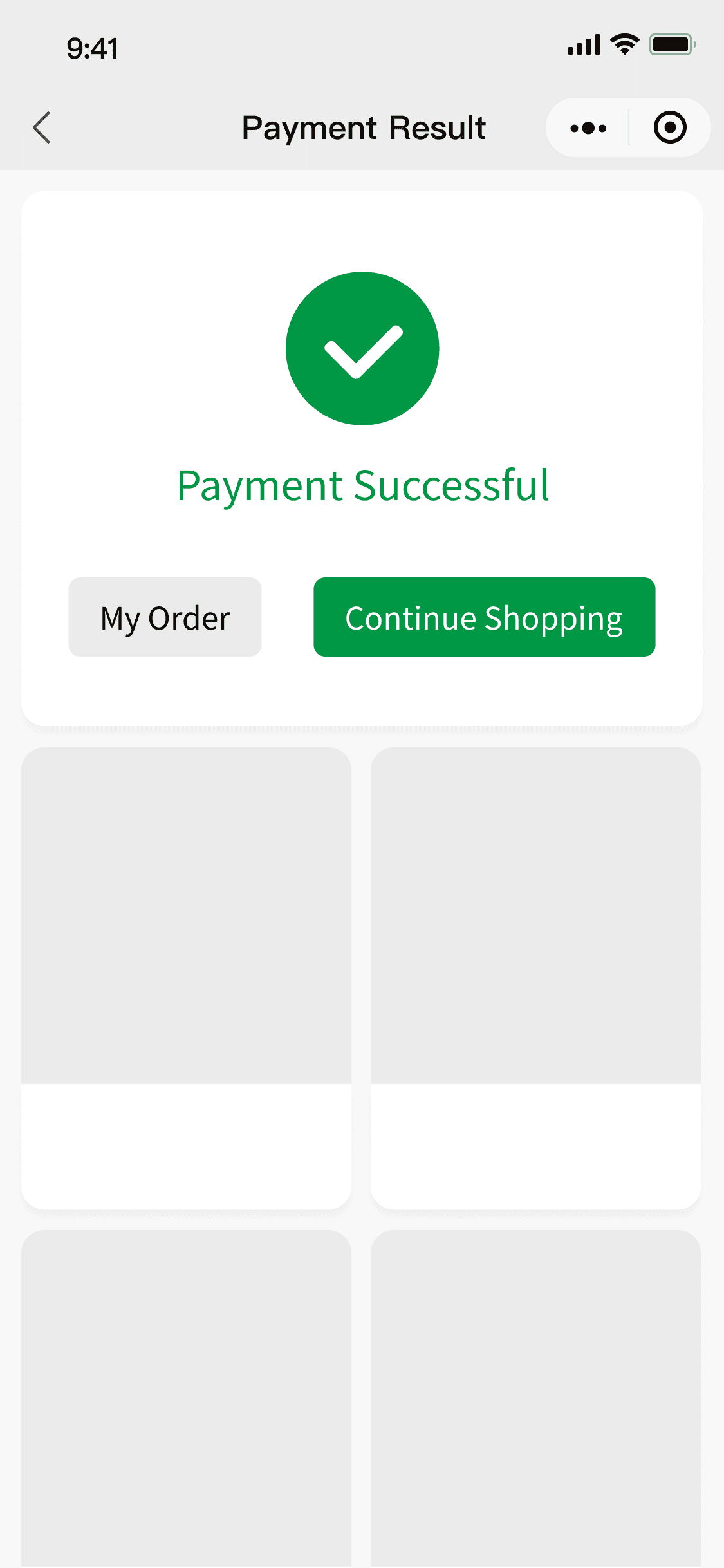
No shopping cart functionality
Lack of information about discounts and savings
High rate of abandoned transactions
The reason why these issues would happen and had remain for a long time was because:
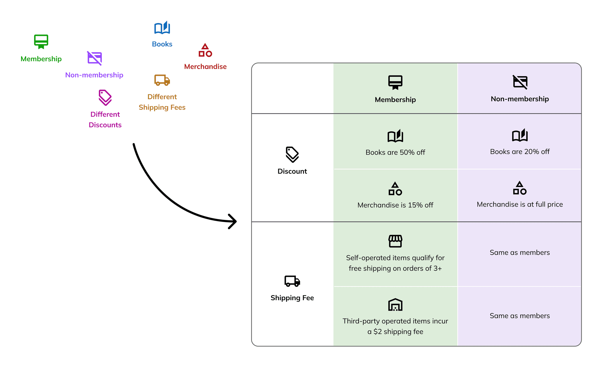
The online shop is a mixture of different discounts, varied shipping fees from multiple warehouses, and different pricing structures for members and non-members.
Offering books, merchandise, and event tickets, their checkout process had to manage these complexities seamlessly.
Solution
Enhanced checkout experience
Reduced abandonment rate by 12%
Clearer and more informed shopping process
Design Process
1. Before Design
Aligning Goals and Constraints
Before starting the design process, I held a brief discussion with the Product Manager to understand the goals and challenges. The primary objective was to incorporate a shopping cart to create a seamless shopping experience.
Additionally, I inquired about any potential technical constraints to be aware of. After confirming that there were no existing technical roadblocks, I proceeded with the design.
2. Ideation
Bringing Order to the Chaos
Based on the design requirements, I organized all item types into a single table to simplify the complexity and provide a clear structure.
This organization helps streamline the process and serves as a guide for the next design steps.
After organizing all item types, I decided to design separate experiences for members and non-members to cater to their unique benefits and pricing structures.
Prototypes and rationale:
3. Iteration & Design Decision
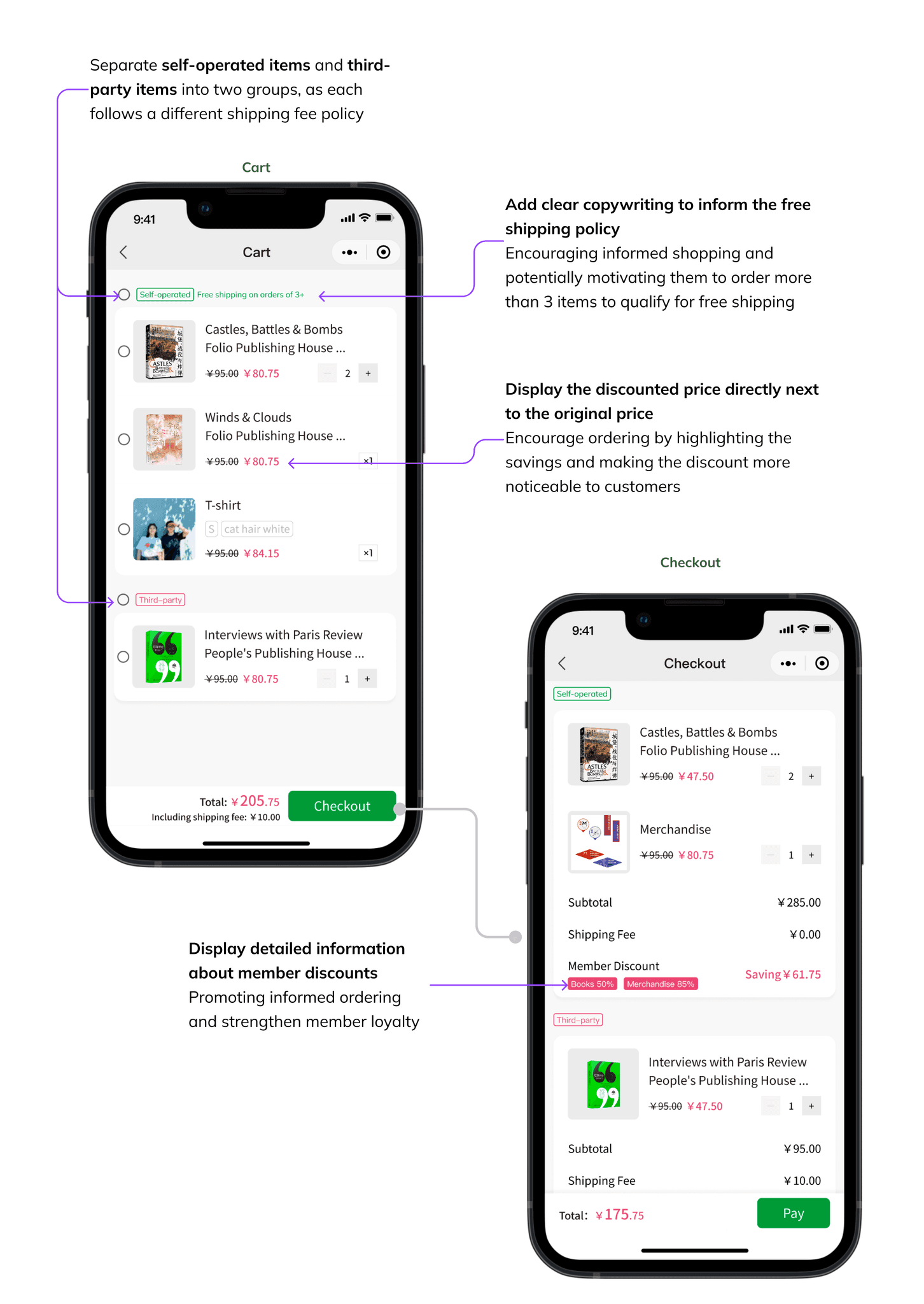
Balance Clarity and Simplicity in Price Display
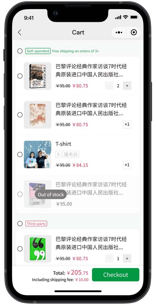
In Version 1, I used labels to display discounts for each item and added "Subtotal" and "Shipping Fee."
My goal was to provide users with clear price breakdowns and, from a business perspective, highlight discounts and savings to encourage shopping and build user loyalty.
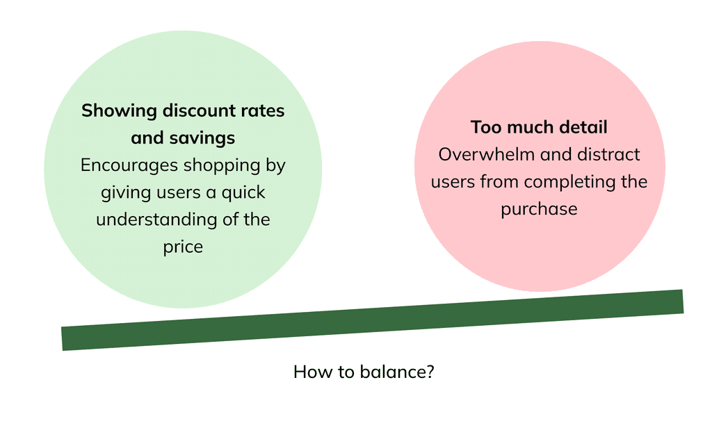
However, due to screen size limitations and the complexity of the information, I realized that presenting too many details could overwhelm users.
V1
Displayed the different discount rates for books and merchandise
Separated "Subtotal" and "Shipping Fee" for self-operated and third-party items
I realized there is a dilemma:
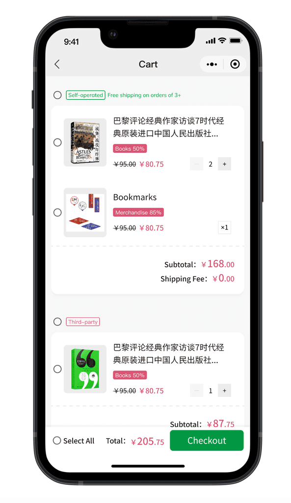
After team discussions and market research, I made the following iterations:
Move discount details to the checkout page:
Since the platform primarily sells books, showing discounts for each item became repetitive and unnecessary at this stage.
Remove the "Subtotal":
If users want to check the subtotal, they can select the items, and the price will be displayed in "Total", making a separate subtotal redundant.
Display the shipping fee under the total price:
To save space, the shipping fee was moved near the checkout button, as the shipping policy is already mentioned at the top of the page.
V2
Removed the discount labels
Removed "Subtotal" and "Shipping Fee" sections
Display the shipping fee under the "Total"
Given more time, I would have liked to conduct additional experiments and run A/B tests to further validate the design. However, due to time constraints, we couldn't implement this. Despite that, the KPIs indicate positive results.
4. Interaction Design and Documentation
Seamless Collaboration with Development Team
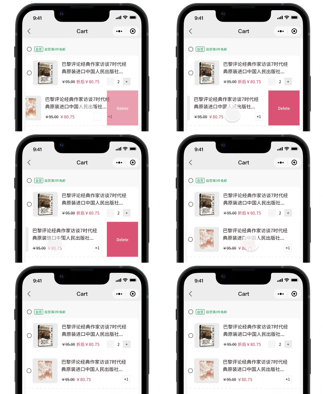
Based on the development team's requirements, I incorporated designs for item deletion through dragging and for out-of-stock items. After receiving team approval, I delivered the final assets and completed the design.

巴黎评论经典作家访谈7时代经典原装进口中国人民出版社...
¥95.00
Out of stock
5. Reflections
While user testing is a widely recognized method for validating design solutions, real-world projects often demand rapid prototyping due to various constraints.
In this instance, we prioritized research over traditional user testing to ensure a user-friendly design. This strategic choice enabled us to quickly gather insights and make informed design decisions grounded in existing data and best practices.
Through this process, I gained valuable insights into the distinct considerations involved in designing for web platforms versus mobile. Each platform presents unique challenges, such as accommodating varying screen sizes, optimizing user interactions, and enhancing accessibility. This experience has deepened my understanding of how to craft seamless and engaging user experiences tailored to each platform's specific needs.
