Redesign Behance from a Product Perspective
Reduced navigation errors by 20% and increased visibility by 40%
Time
Sep to Nov, 2023
Tool
Figma
My Role
UX/UI Designer
Client
Project Overview
Behance is widely used by artists to explore inspiration and showcase their work. As a longstanding user of Behance, I have actively engaged with this exceptional platform.
Although Behance is a respected platform, I have noticed several user experience issues during my interactions with it. Given its target audience of designers and artists, who have a keen eye for detail and are more critical than typical users, there are opportunities for improvement to better meet their expectations.
My Goal
Outcome
Design Process
1. Defining Target Users and Their Needs
I decided to create user stories to better align Behance’s features and design decisions with the needs of its diverse user base. By breaking the stories into three main user groups, I can more effectively address the specific goals and challenges of each segment.
This separation not only informs more targeted design decisions but also serves as a reminder to stay focused on the core needs of these users.
User Stories

As a junior designer, I want to…
explore trending designs to gain insights and learn from the work of others.
Key experiences:
Exploration
Regularly browse the “For You”, “Following” and “Discover” sections
Saving Favorites
Saves projects to personal mood boards for future reference and inspiration

As an experienced designer, I want to…
showcase my portfolio to build my personal brand, increase visibility, and attract new clients.
Key experiences:
Sharing their work
Showcase their work, receive feedback, and organize their portfolio

As a client, I want to…
efficiently identify suitable designers for specific projects that fit within my budget.
Key experiences:
Search & Filter
Filter portfolios by specific skills and fields
Exploration
Browse to discover popular designers
2. Three Types of Existing Problems & Recommended Solutions
Product Problem Resolution
Visibility and Clarity Issues with the Share Button
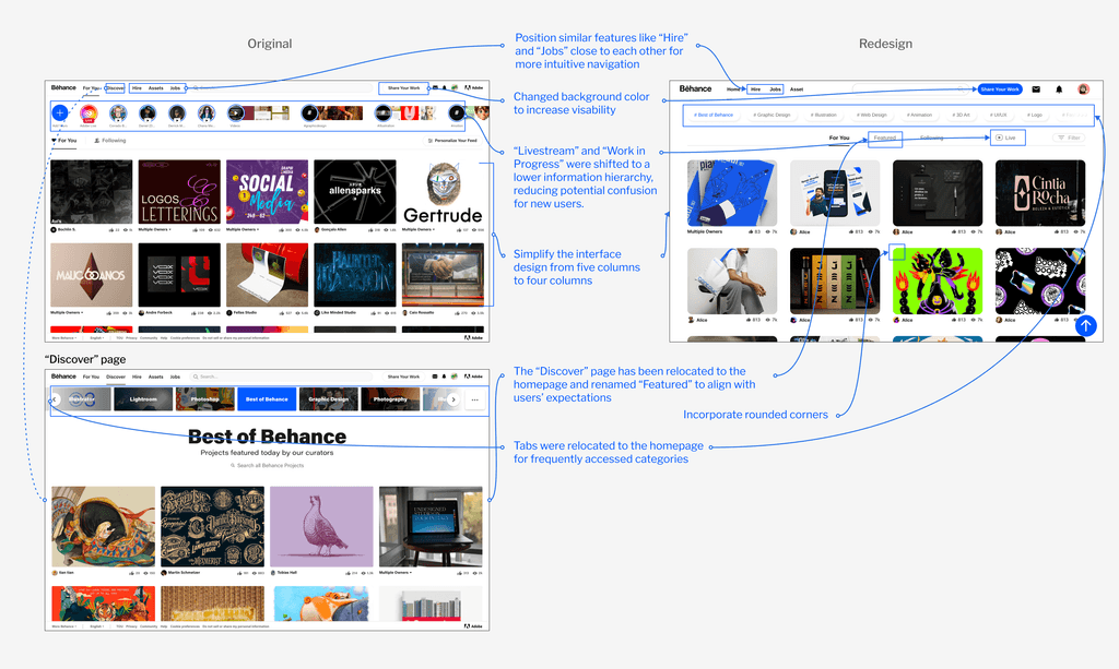
While the “Share Your Work” button is on a white background, the “Add Yours” button for Livestream is highlighted by the theme colour, leading to misclicking when user wants to share their work.
As a platform that relies heavily on user-generated content (UGC), encouraging users to share their work is vital for Behance's growth. Sharing outstanding projects not only helps creators enhance their reputation but also attracts junior designers and clients, fostering a positive cycle within the community.
Therefore, I believe the Share Button should be positioned as a primary feature from both UX and product perspectives.
Solution
Share Your Work
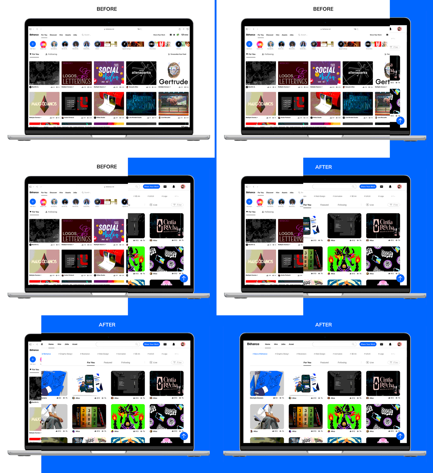
Change the background color of the 'Share Your Work' button to the theme color, making it a primary button. This adjustment will reduce misclicks and encourage users to share their work.
Evaluating the Effectiveness of “Livestream” and “Work in Progress” Features
“Livestream” and “Work in Progress” are new features introduced by Behance in recent years, they are positioned in the most prominent area beneath the navigation bar.
“Livestream”: Users can watch videos made by Adobe and other artists, like drawing processes and lessons.
“Work in Progress”: Like the Instagram Shorts, the pictures posted will be automatically deleted in 24 hours.
While these features demonstrate Behance's ambition to provide creators with more visibility, they seem to diverge from the platform's core user needs—exploration, sharing work, and searching. Despite being placed in a prominent area, the view count remains unexpectedly low, indicating that this feature might not be meeting the needs of the target users.
User testing further revealed that prioritizing these features in the interface hierarchy caused confusion and led to issues with navigation and error prevention, highlighting a potential mismatch between feature emphasis and user expectations.
Solution
Establish a clearer hierarchy to minimize misclicks by lowering the priority of “Livestream” and “Work in Progress”. This adjustment will prevent misunderstandings and reduce user errors.
UX Problem Resolution
Information Architecture Issue of Discover Page
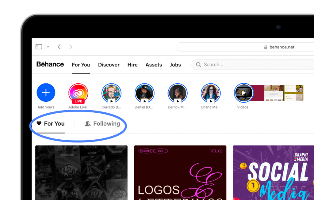
Behance offers three ways to access content:
“For You”: Personalized content based on user preferences
“Following”: Content from creators you follow
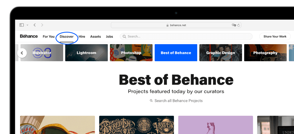
“Discover”: Curated content selected by Behance editors
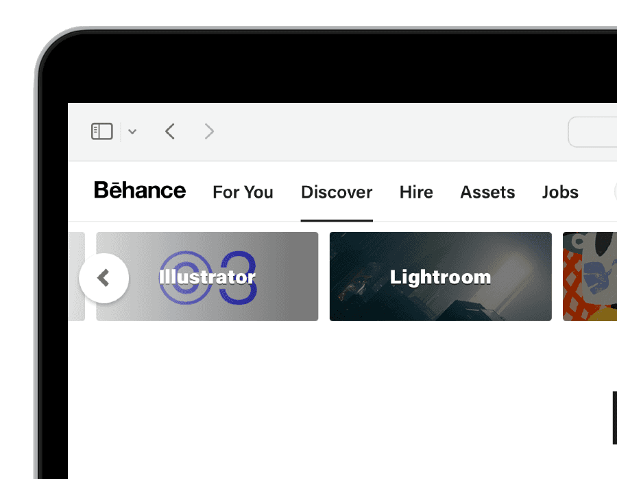
While "For You" and "Following" are prominently featured on the homepage, "Discover" is only listed in the navigation bar on the second page, reducing its visibility and accessibility.
Compared to competitors like Dribbble and Pinterest, Behance's uniqueness lies in its curated content, not solely driven by algorithms. Therefore, the "Discover" page should be given a higher priority in the interface hierarchy.
Solution
Well-organized information architecture
Relocate the “Discover” page to the homepage, grouping the three main browsing functions together for easier navigation.
Reduce Clicks for Categories
The category chips are currently located on the "Discover" page, making them difficult for new users to notice and requiring two clicks to access.
Category chips serve as both a shortcut for users exploring specific fields and a visual guide to the platform's content offerings. To improve usability, I redesigned the category chips and relocated them to the homepage for easier access and better visibility.
Solution
# Best of Behance
# Graphic Design
# Illustration
# Web Design
# Animation
# 3D Art
# UI/UX
# Logo
# Fashion
# Craft
# Fine Art
# Architecture
# Advertising
Introduce chips for frequently accessed categories to enable swift and convenient navigation.
UI Refinement
Creating a Friendly and Inviting Interface
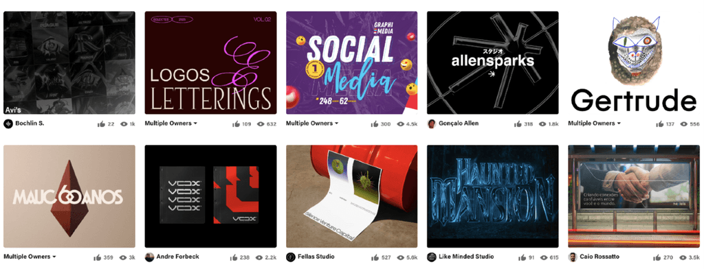
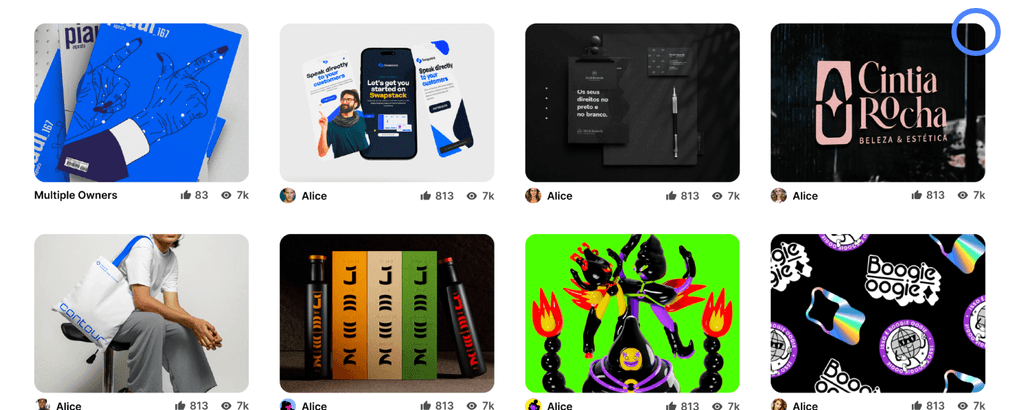
While the simplicity and clarity of the website's design are commendable, the presentation of content in five columns with minimal spacing might potentially overwhelm users.
Solution
Clean and minimalist design
Simplify the interface design from five columns to four columns, to make the main section less overwhelming for users.
Incorporate rounded corners to enhance the design's friendly and inviting appearance.
3. High-Fidelity Prototype
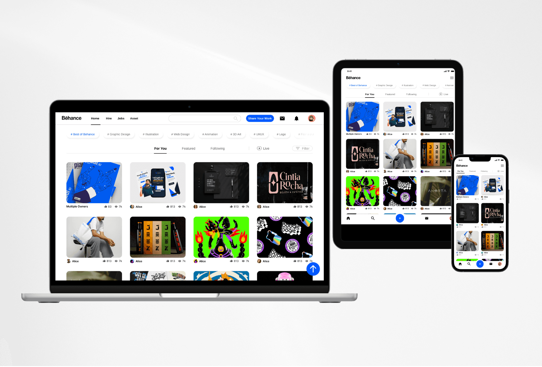
The content is positioned at the center of the main section, with similar features aligned in parallel, ensuring easy access for users.
Tabs were introduced for frequently accessed categories and can be scrolled while hovering, enabling swift and convenient navigation.
4. Usability Testings and Iteration
Round 1:
Task-based Usability Testing
To assess the functionality of the prototype, I organized a task-based usability test involving five users. All the participants have an art/design background.
Tasks:
Find a project under the UX category.
Find the page with a collection of content selected by editors.
Save the works you like to the mood board.
Find out how to share your project.
Do users rate their experience as satisfying or enjoyable?
Is anything confusing or unclear?
Do users know how to share their projects?
Findings
100% of the tasks were completed with no errors
“Intuitive.” “Easy to use.”
Users expected the "Discover" page to showcase personalized content based on data, similar to many other websites. However, it features content handpicked by Behance editors.
Users didn't notice the scroll functionality for category tabs.

Iteration Based on Findings
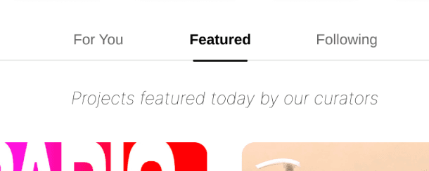
Change the language of “Discover” tab into “Featured” to match the expectation of users.
Modified category designs to indicate scrollability.

Round 2:
A/B Testing
After improving the prototype, a follow-up A/B test was conducted to validate the redesign's enhancements.
The five new users haven't used Behance before, they performed the same tasks on both Version A (original design) and Version B (redesign).
Findings
Understanding of Flows and Navigation:
Initial Design
80%
Only 80% of users were able to access the discover page, indicating a potential usability issue.
Redesign
100%
There was a significant improvement with 100% of users successfully navigating to all pages, demonstrating a clear enhancement in user flow and navigation ease.
Ability to Share Projects:
Initial Design
60%
Only 60% of users correctly identified the sharing function, while 2 out of 5 users were confused by the blue button, mistaking it for the share option.
Redesign
100%
There was a marked improvement with 100% of users correctly finding and using the share button, indicating the redesign effectively addressed the initial confusion.
User Satisfaction and Enjoyment:
Feedback: Three users specifically commended the simplified and more visually appealing interface of Redesign compared to Initial Design, indicating a preference for cleaner, less cluttered designs that prioritize user experience.
Two users felt that both versions were satisfactory, showing no strong preference for one over the other.
Additionally, one user appreciated the simplified tabs in Redesign, suggesting that the category in this version was more user-friendly.
“The simple background made it easier to find the category that I’m looking for.”
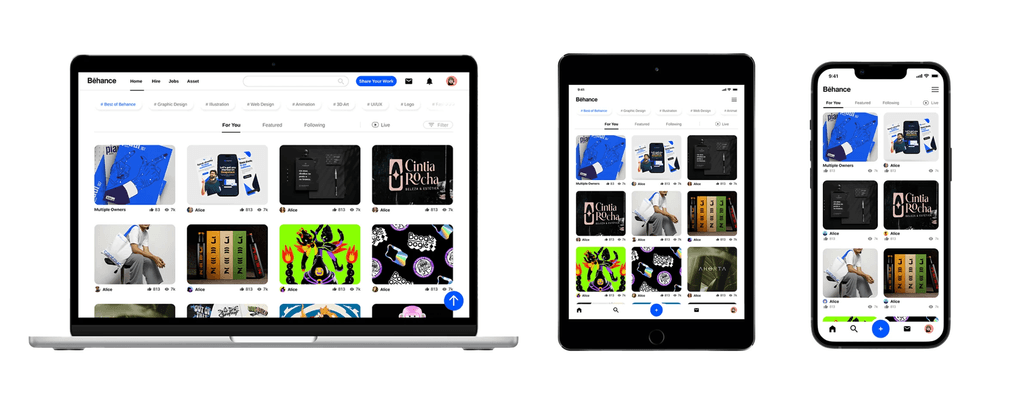
5. Consistent Cross-Platform Design
6. Reflections
1. Balancing Stakeholder and User Needs:
Learned the importance of aligning stakeholder aspirations with actual user needs. For example, features like "Livestreams" and "Work in Progress" were designed to build community but often didn't align with the primary user needs, leading to minimal engagement and misclicks. This highlighted the necessity of a user-centered approach in design.
2. Usability vs. Aesthetic Appeal:
Discovered the paramount importance of usability in UX design. An illustrative instance was the redesign of category tabs. The original design's colorful tabs were visually appealing but less functional compared to the redesigned simpler, white-background tabs. Usability testing revealed a preference for the latter, as it offered easier navigation and access to content, significantly improving the user experience.
3. Data-Driven Design Decisions:
Utilized data from A/B testing to make informed decisions, ensuring that changes were not just aesthetically driven but also empirically supported.
